Nothing is more UNIQUE than custom-made stationery!
www.rwdesign.ca
Showing posts with label Invitations Gallery. Show all posts

Sunday, February 6, 2011

Letterpress envy!


Today's Ottawa Citizen newspaper featured a nice long article on Ottawa-based letterpress company Dempsey Press. The couple (Vanessa Dempsey & Mike Freeman) create unique designs for greeting cards, whacky stationery, business cards and invitations/announcements on a massive "vintage Heidelberg Windmill Red Ball press" using rich, luxe paper product. Although I have not personally seen their work, I do know about these presses and get goosebumps thinking of the gorgeous final products that they create (insert jealous pangs here!!!).

These types of presses are a fortune to buy (that is if you can even get your hands on a classic one) and another fortune to maintain, but they really do allow for some creative and beautiful works. Of course, products end up on the pricier side for the client, but if this is a style or look you are going for and it's in the budget, I encourage you to support the local guys and give them a try. Their portfolio of pics online is a little bleak, but (as I know personally) that could mean that they are just too busy with orders to get them on there!!!

Enjoy readers and click here for the full article.

Breakfast at Tiffany's Shower

So, I was super excited to share pics of one of my latest projects, but upon checking them out, I am now super disappointed with...my camera! Lol! I know, I know, if I had a dollar for everytime I complained about my lack of a good camera, I would have one by now!!!

Anyway, it is the design and colours that I love so much about this fun Breakfast at Tiffany's-themed Bridal Shower Invitation. The party planner, Lesley, sent me a picture of a similar invitation that she had found somewhere on-line and requested Tiffany blue square envelopes. I was able to find them in a shimmer finish to match the shimmer of the off-white cardstock that the invitation was printed on. With a deeper shade of Tiffany blue as the second layer, the complete package looks so stunning - I can't wait for the bride-to-be to see them after the shower! It was fun playing with different fonts and graphics (including an imitation Audrey Hepburn pose from the classic film). So, the moral of the story is...don't judge based on the quality of this picture - the final product looks classy and fun!

FYI: if you are planning on creating and sending square cards or invitations by mail, be sure to allow for extra postage in your budget. They cost about double as much as rectangular-sized envelopes (ie: over a dollar each).

Thursday, January 13, 2011

Invitation Gallery 7


As I've always said, it is super helpful when a couple come to me looking for stationery and know what they want. In the case of Kristian and Michael, they had an exact picture that they found online and with just a few adjustments to colour and layout, I was able to come up with exactly what they were looking for. The Toronto couple will be getting married in Florida with a smaller guest list, but wanted to share their joy when they return by holding a reception for all those who could not attend the smaller destination ceremony.

Since Kristian will be taking her future husband's family name, we chose to put the first initial of his family name (the "S") as a dark watermark in pink in the place of an ampersand ("&"). I love the cursive and caps mix as well as the pink on ivory on black. Very chic, simple and elegant!

They are also having programs, candy jar labels, place cards and itineraries made, so I will keep you posted as they are created.

Best wishes to the happy couple as they continue with their plans!

Thursday, November 25, 2010

Real Weddings: Giulia & Michael


I am thrilled to share some more gorgeous pictures from another amazing Ottawa Wedding. Giulia and Michael we married at Blessed Sacrament and held their reception at Centurion Conference and Event Centre in September. Now Giulia was a bride who had a vision and knew what she wanted from the start (which can be a dream for the stationery designer)...and this vision and determination is quite clear when you look at how the day came together in her pictures...everything looks absolutely perfect!

The vibrant purple, used in everything from dresses, flowers, favours, stationery and pew bows to the brides own shoes, looks stunning in contrast to the elements of white and black alike. I also really like the softness of the white hydrangea bouquets set low as the centrepiece on black linens.

Like couple Karen and Chris, she made use of the Ottawa U campus for her portraits. (Why had I not thought of this location before?) I especially love the one of the Bridal Party on the stairs. What a gorgeous couple, and wedding party! Congratulations Giulia and Michael and many thanks for sharing your day with us! I know these pictures will inspire those in planning mode!

Friday, November 12, 2010

Invitation Themes


Check out WeddingBells latest article and pictures of themed invitations to get you inspired. I am loving this "Boho" style - I do like pocket invitations, but really love this simple card style with one pocket at the bottom. I would like to see what it looks like folded...perhaps a monogram on the card? Anyway, the grey and white with a splash of aqua is just striking! Love it!

Check out their website for more.

Sunday, November 7, 2010

It's beginning to look a lot like...


I had some girlfriends over last night for some wine, munchies and...(wait for it...) some Holiday card-making! We had a blast using some gorgeous Stampin' Up products, some holiday-themed scrapbook paper and a whole lot of creativity.

If you would like to place a holiday order for cards, tags or wine bottle sleeves/tags, just send me an email and we'll come up with something special for you!

I am really on the ball this year! Maybe I should get my holiday shopping done while I'm at it?

Tuesday, July 13, 2010

Postage Stamps


So I let you know in a March post about the importance of choosing beautiful stamps to highlight your gorgeous stationery right?! Well in addition to the Canadian Orchid series that you can purchase through Canada Post (in rolls of 100 even), they now also have an African Violet series (sold in booklets of 10). They are equally elegant and can also be purchased online.

Also, if you are not sure about the weight or size of your envelopes, always side with caution and bring one in to your local post office to be weighed or measured. You may need an extra stamp and would not want to send them out only to have them all returned!

Friday, June 11, 2010

Invitation Gallery 6


My latest client came to me with absolutely no idea of what she wanted! She liked simple, clean and elegant styles as we looked through pictures together and was able to see what she didn't like (which is super helpful as well!). I created these three samples for her...all quite different, but equally elegant. She ended up loving the font from the embossed single layer, but the elegance of the pocket fold invitation - so we are mixing the two for her final version. I'll be sure to post it when they are completed.

Sorry, the pictures turned out a little blurry - I'll re-try and post them again :(


Cheers!

Thursday, May 27, 2010

Baby Shower Invite Gallery 2


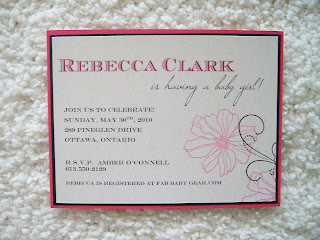
O.K....so I know that these look a lot like the ones I posted last month! The hostess saw the Baby Shower Invitations on my blog and just fell in love (and I don't blame her!) They are just so elegant and pretty too - I'm really into "pretty" right now. The reverse of the antique printed baroque paper is a slate grey. I think that the matching baby blue envelopes really "seal the deal" as well! (Wow - you know it's time for bed when I start using cheesy puns in my writing)...On that note, until next time!

Sunday, May 16, 2010

Invitation Gallery 4 & 5


Told you I have been busy! Here are some more samples created for two couples with different styles. The first happens to be an old friend I haven't seen since high school - what a fun way to reconnect! She is getting married in the Fall and hosting a large wedding celebration with guests coming from as far as Italy. Her style is quite classic and elegant. I love the use of the purple ribbon as an accent. I will be sure to post their choice after we figure it all out!

The second couple are to be married next month by the water in Bristol, Quebec. The bride-to-be even told me that she will be hopping on a jet-ski for some fun pictures (eek...the dress!) They new exactly what they wanted for their invitations - two birds on a branch...so we mixed and matched colours to see how it would turn out. I will post the final invitation choice and inserts tomorrow.

Enjoy!

Wednesday, April 21, 2010

Shower Invitations Gallery 1


I promised to add some Shower Invitation samples and am finally getting around to it! These two invitations can be used for trendy Baby Showers, Bridal Showers or any special event really. I especially loved working with the soft blue textured paper and the baroque design on the bottom layer of the first invitation ... I think that they look so elegant (if I say so myself!!!) I hope that they inspire you.

Saturday, April 10, 2010

Invitation Gallery 3


I remember when planning my own wedding just how much I loved looking on-line at what others had done, so I hope these posts of picture "galleries" inspire some of you!!!

Here are the latest wedding invitation samples created by RW Design. I met with a beautiful bride-to-be and her mother who were planning a late Fall wedding. Keeping that in mind, she wanted to use the Fall colours of vibrant orange and deep brown while incorporating a symbol that holds special meaning to her: the butterfly.

When you hear of the colours orange and brown together, it seems difficult at first to imagine the outcome; however, with the right shades and accents, I believe that they really look warm and elegant. So what have we learned: don't be afraid to try something different!

I will keep you posted on which wedding invitation she chooses...so stay tuned!

Wednesday, March 31, 2010

Invitation Gallery 2


Here is a second round of sample invitations. This bride-to-be was also looking for the long, layered look, but preferred the vertical style. She was super easy-going and let me create a few different looks while respecting the black, ivory and green theme of colour that she was looking for.

Once again, the first picture shows some samples that I created, while the second shows the invitation that she chose - she just loved the rhinestone detail...and so do I!

Invitation Gallery 1


As I always say, "custom" means unique! Whenever I meet with new clients, I like to get a sense of what they are looking for in their stationery. We discuss colours, themes, styles or pictures that inspire them and so on. When you meet with your stationery designer, it is always helpful to bring with you anything that inspires your style - such as fabric swatches (perhaps the bridesmaids dresses), pictures of your flowers, or stationery that you have found in magazines or on-line that stuck out in your mind.

For my clients, I typically create a few samples based on what we discussed at our first consultation. Then, at our next meeting, we can truly find what the client likes or dislikes from the samples in order to come up with the final design.

The top two pictures show some samples that were created using different colours, fonts and embossed prints, while always sticking to the main colour and style theme of green and silver grey, long and layered invitations. The third picture shows the invitation that the bride-to-be chose in the end for her wedding invitations!